


Football Postmortem: Yeah, The Offense Was Really That Bad
Brian has been working with college football play-by-play data from the 2005 season, and has this week written a series of posts discussing third down efficiency. Earlier today, he made his data available to the masses, and you can go take a look at the graphical breakdowns (efficiency, third down distance) for every DI-A team.
The graphs for NC State's offense are every bit as ugly as you would expect. Here is the first:

Click the image to view a larger version, or better yet, head over to mgoblog and fiddle around with this stuff yourself. Reading the graph is pretty straightforward: on the y-axis is 3rd down conversion percentage, on the x-axis is yards to go. The thick line represents the national average, while the thinner line represents the team's 3rd down efficiency. Anything above the NCAA average is in green, while anything below it is in red.
Not surprisingly, NC State's offense struggled mightily in almost every third down situation. The offense wasn't just a little bad at converting third downs; it wasn't even in the ballpark of the NCAA average. The gap is actually at its largest in 3rd-and-short situations, which tells you all you need to know about the offensive line's performance. On 3rd-and-1, the national conversion pct. in 2005 was about 68%. NC State's was 38%. On 3rd-and-1! One yard. One stinkin' yard.
I offer my best wishes to departed OL coach Mike Barry as he assumes a job with the Detroit Lions, but I'm glad we're going to have someone new coaching our offensive line in 2006.
Let's move on to the graph that examines third down distance:
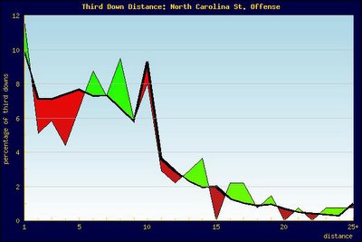
The coloring works the same way for this graph as the first one, though it's more for differentiation than for designation of good and bad. This graph illustrates what percentage of NC State's third downs occurred at the various distances listed on the x-axis. For example, about 8% of NC State's third downs were 3rd-and-10s.
What we see in the graph is pretty consistent with what we would expect from a team that insisted on pounding away with its crappy running game. The Pack saw a lot fewer third downs in the 2-5 yard range than the average team did, and a fair bit more in the 6-9 yard range. Our inclination to run the ball the majority of the time on first down helped us in that we faced fewer 3rd-and-10s than average, but, clearly, that inclination only moved us forward so far. Maybe they weren't 3rd-and-10s, but they were still 3rd-and-longs.
1st down: Andre Brown carries for one yard
2nd down: Andre Brown carries for two yards
3rd down: Marcus Stone pass incomplete
On to the final chart, which breaks down the number of third down plays at each distance:

The blue portion represents failed attempts, the red represents conversions. So on 3rd-and-1, for instance, NC State was a pathetic 6-16 (37.5%). It's really amazing to see how bad we were in short yardage situations. When you look at the shorter distances, there's hardly any discernable improvement in conversion percentage from the longer distances. NC State posted its lowest rates in 3rd-and-8 and 3rd-and-9, but those conversion percentages weren't nearly as bad in relation to the national average as our short yardage percentages were (as evidenced by the first graph).
All this unpleasantness has no doubt left a sour taste in your mouth, so I will end this post with the NC State defense's 3rd down efficiency graph:
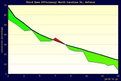
Look at all of that delicious green.
posted by Steven @ 6:53:00 PM |
![]()
![]()


